Design That Delivers Results
MSY Website Review
Time Line:10-24 September, 2025
Role:Product Designer
Constraints:20 hours, no user testing, reading time ~3 min
Website: msy.com.au
I analyzed the MSY website as part of a course assignment to review its UI design patterns, identify usability issues, and propose improvements.
View full redesign here: figma/dandediu
Goal
Improve the interface to:
- Increase conversion
- Build trust and improve retention
- Lower support costs
Process
When I checked the site against best practices for usability and UI design patterns, I found the following major problems:
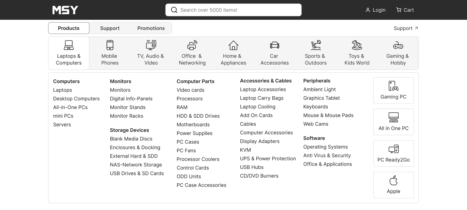
Navigation
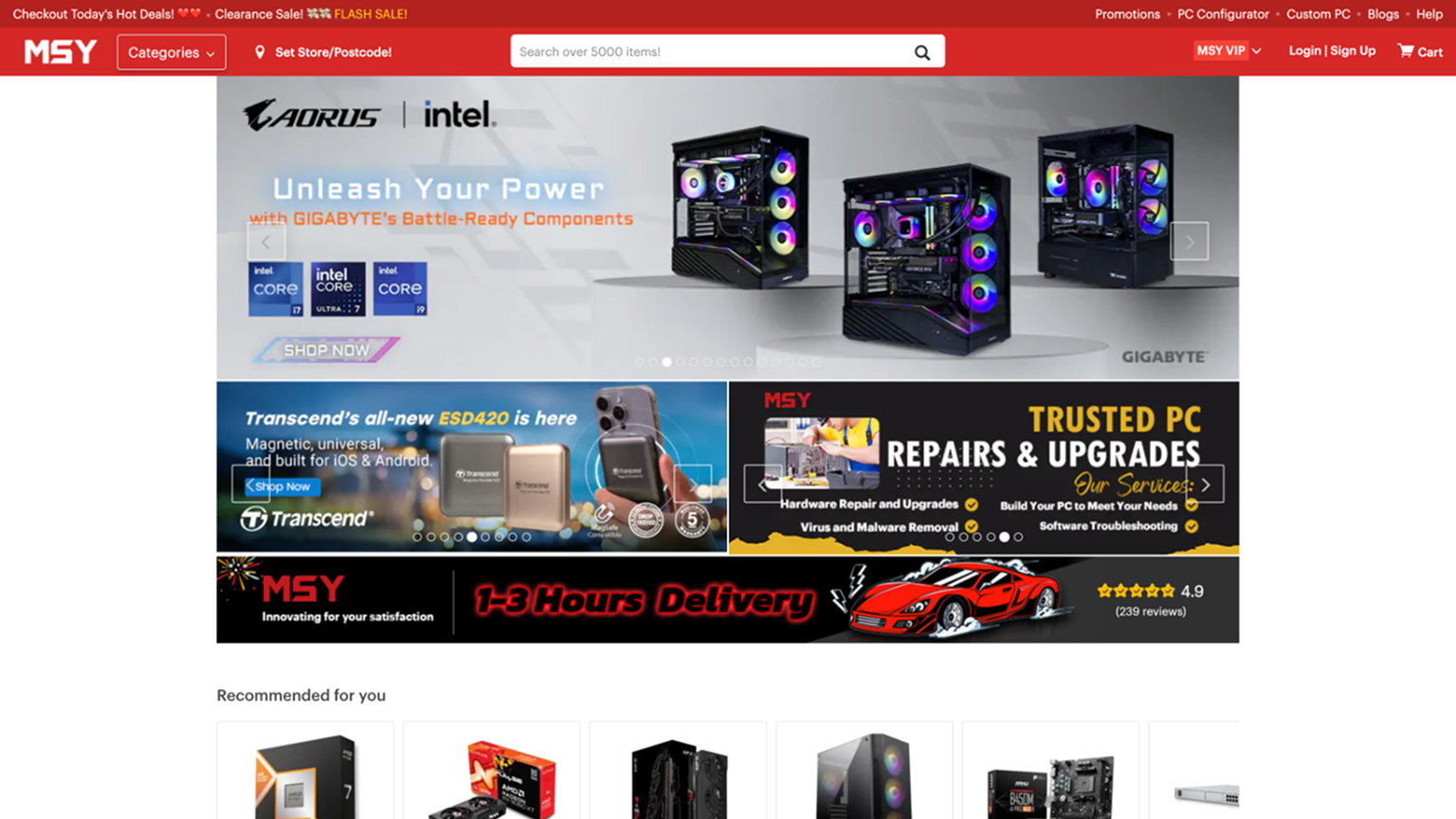
- On desktop resolutions, the header is much wider than other parts of the page. It has too many elements that are competing for attention.
- The current dimensions of the mega-dropdown are covering the whole screen and hiding content.
- Too many categories are presented on the left-side menu of the mega-dropdown.
- The drop-down menu has unrelated items in the same category.
- There is no preselected category when the drop-down is open (as seen in the image below).
All these downsides are causing confusion and overwhelming the website visitors, impacting the usability and user experience, which later leads to fewer sales.
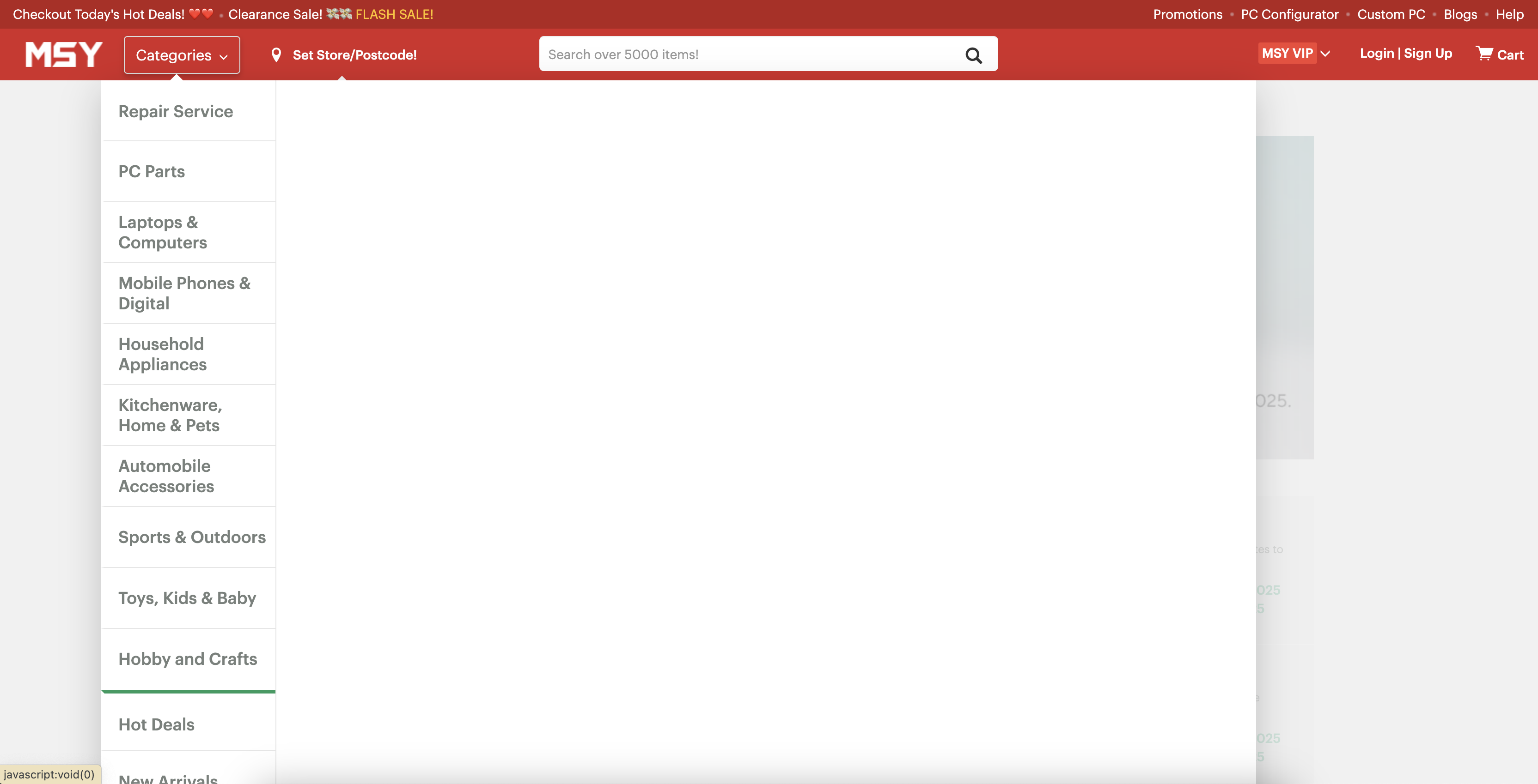
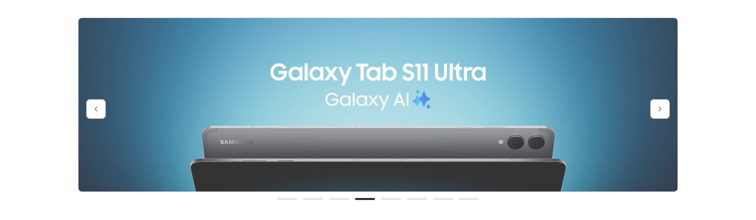
Image Slider
The current three sliders are competing for attention and are a heavy piece of information to process.
Each slider contains:
- Images, which are too crowded and have low quality.
- The text on the images has low contrast.
- The CTAs are just illustrations on the image and don't provide interaction feedback.
- The overwhelming quantity and conflicting messages conveyed by each call to action reduce their effectiveness.
- The side navigation buttons have low contrast.
These shortcomings make people ignore sliders, which leads to low click-through rates, a drop in the return on investment for marketing campaigns (the banner blindness effect), and many problems with accessibility and usability.
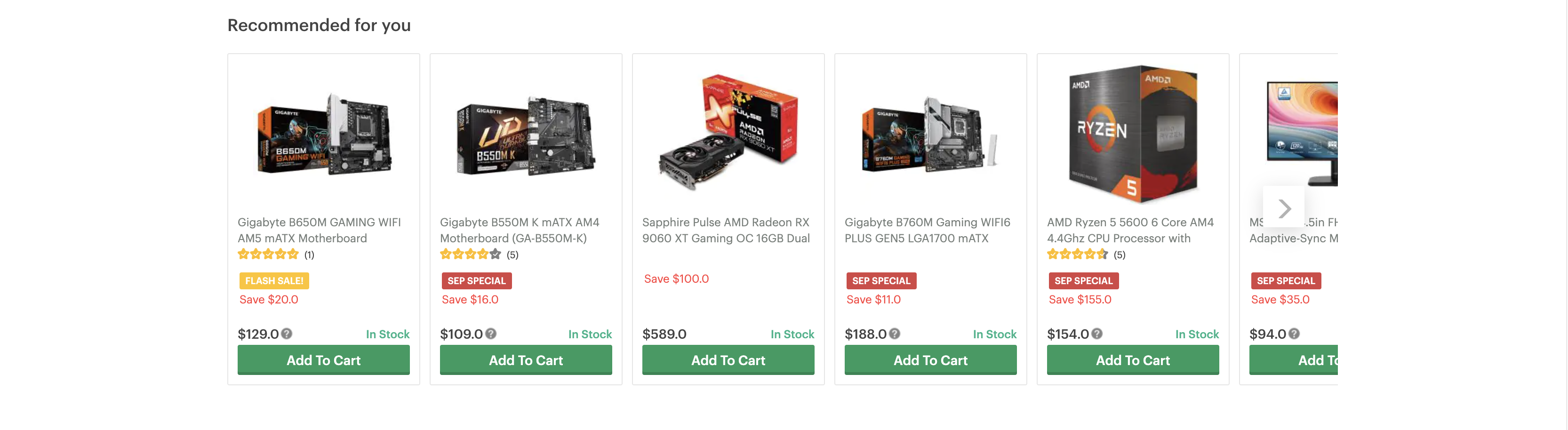
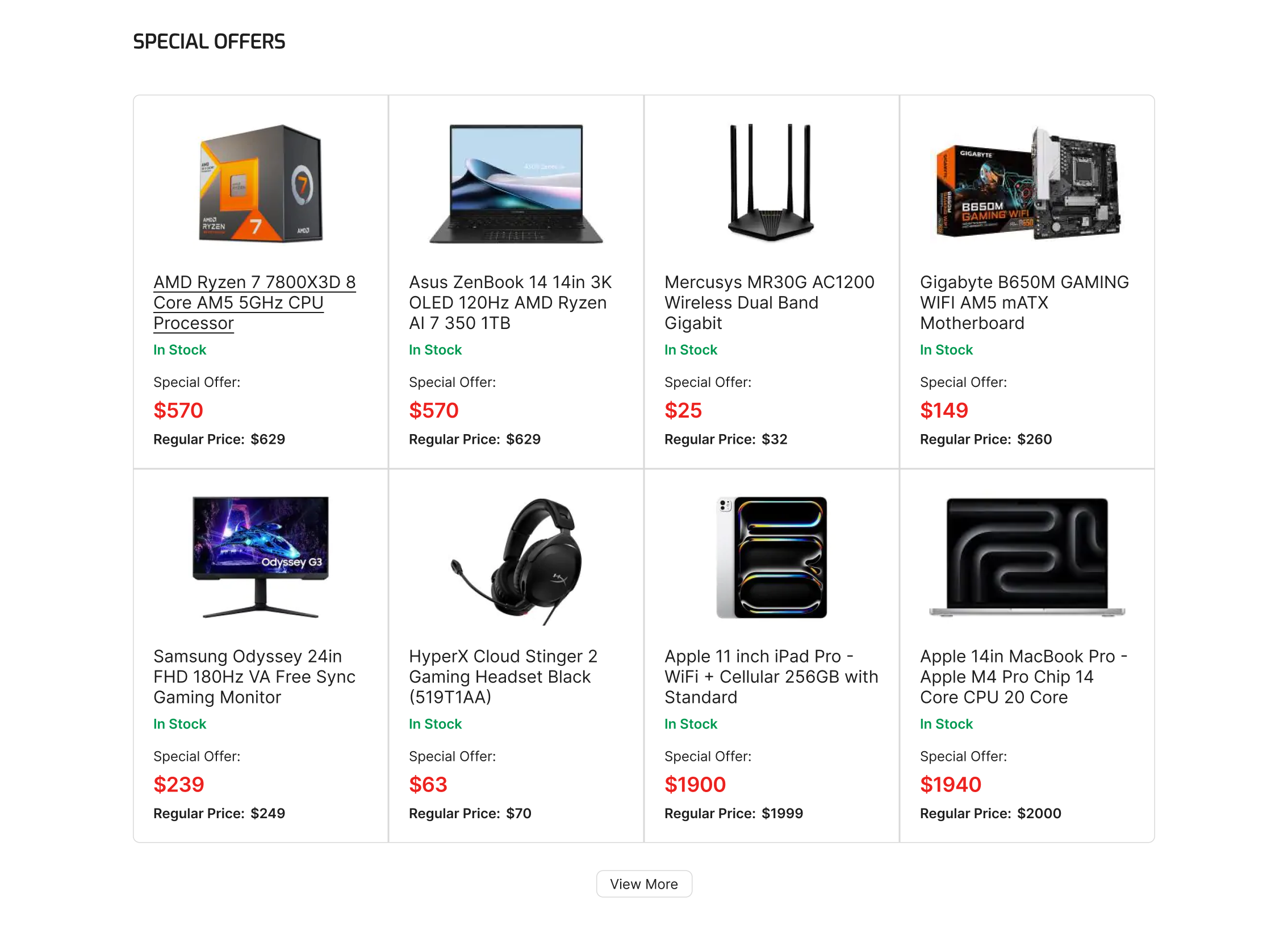
A Suspicious Section
Unregistered users and new users may find the "Recommended for you" section odd. (e.g., How does this website determine my preferences?).
Users who prioritize data privacy are abandoning the website.
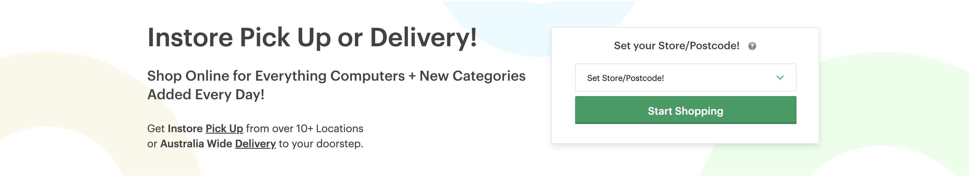
"In-Store Pickup or Deliver" Section
Currently, MSY's product display model prioritizes warehouse inventory visibility. This feature does not present items available in the selected store.
Every link of this section directs to the Footer or the "We're here to help!" section, creating ambiguity regarding the next steps.
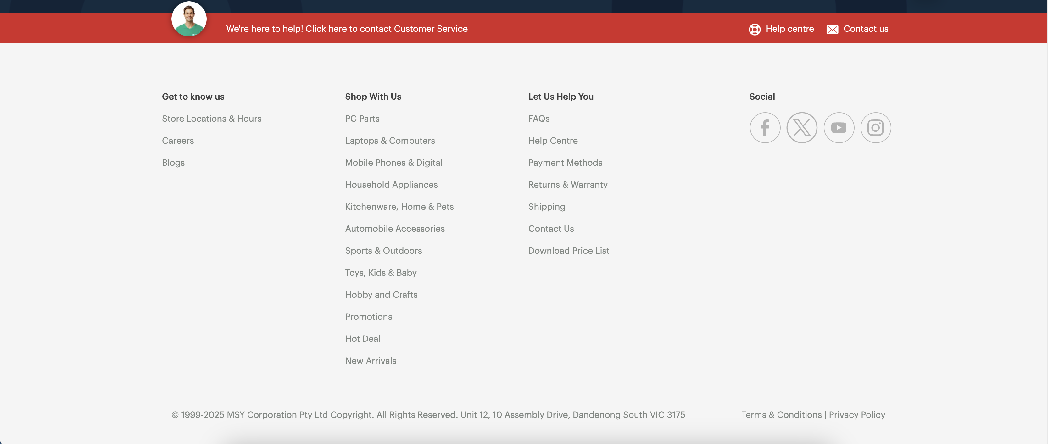
Help & Support
This section lacks the visual hierarchy and appropriate spacing. All links within it direct to the same page, which is redundant.
These problems affect visibility, usability and UX.
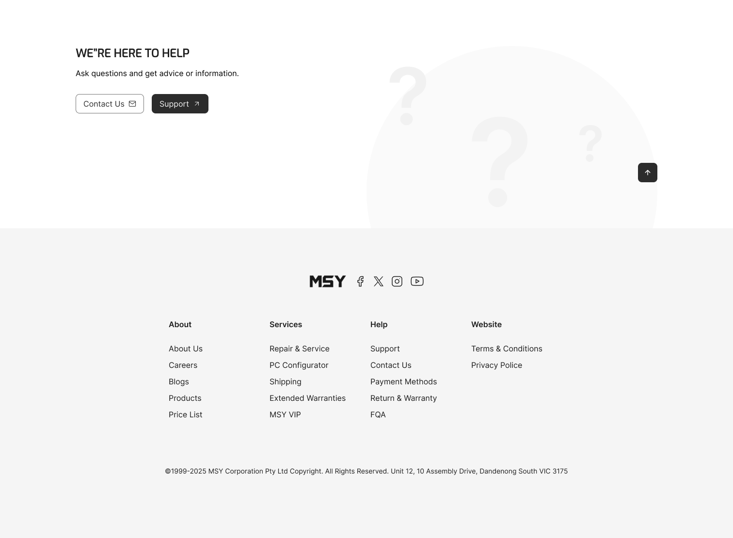
Footer
The low contrast and small font size of the text do not meet accessibility standards (currently Aa 3.31).
The footer’s sitemap lacks structure and visual balance, and it also does not include the company's logo.
These issues are diminishing trust and credibility while also hindering task completion.
The Solution
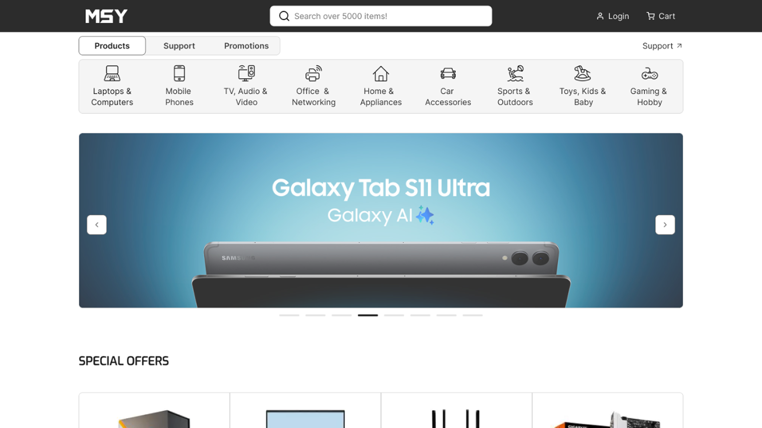
I have made the navigation easier by limiting product categories, organizing, and making it clearer.
According to best practices, it is recommended to have a maximum of 10 categories to avoid confusing and overwhelming users.
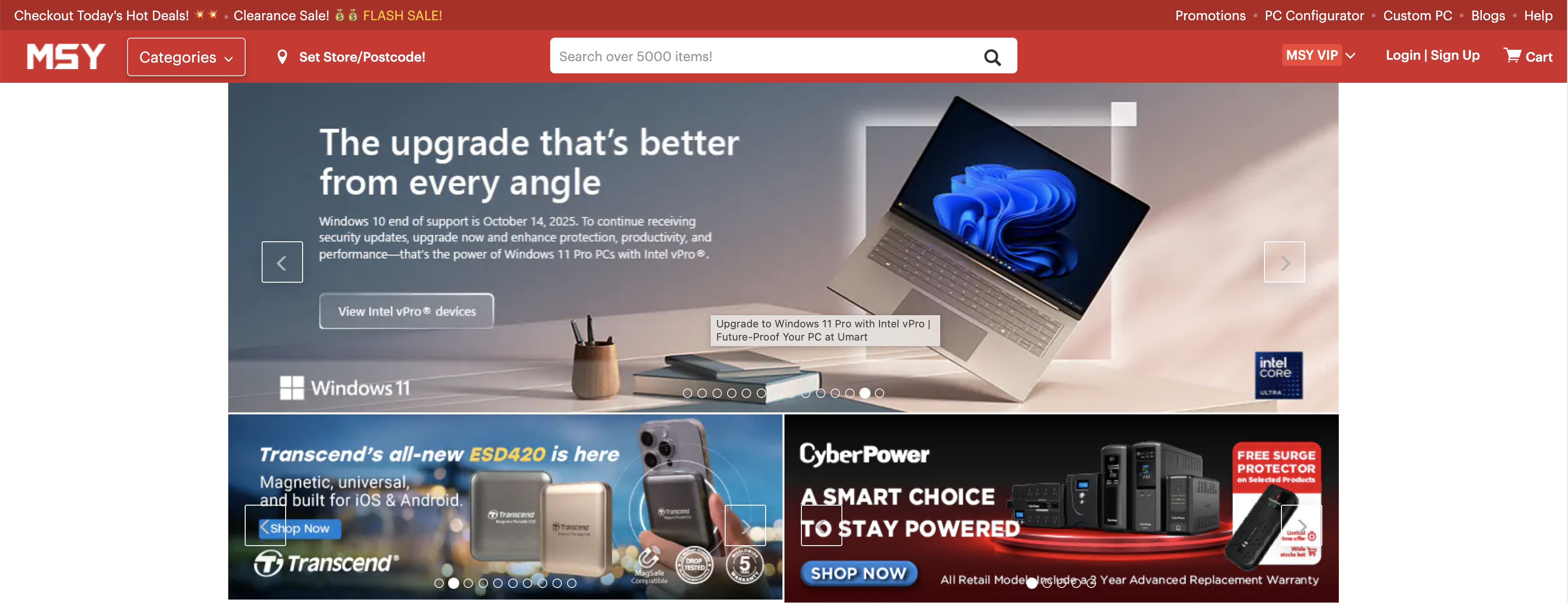
I included one impactful, mobile-friendly slider that has a strong hierarchy and visible buttons to improve usability.
The slider is a deck of banners, so the banner needs to be clear and captivating in less than five seconds. This will get more clicks and lead to more sales.
I removed the "In-Store Pickup or Delivery" section from the home page.
It works better on the checkout page, like on the other websites, which is more common for users. Now the homepage is simpler and does not require additional actions from users. This helps users to find the product they want easier.
I replaced "Recommended for You" with "Special Offers", which is more appealing to users and more commonly used.
I improved visual hierarchy and spacing to make the information easier to perceive.
To make things easier to read and interact with on touch devices, I gave call-to-action buttons clear labels and appropriate dimensions.
I renamed the "Help Centre" to “Support” for consistency with industry standards.
I included a logo in the footer and organized the footer sitemap into logical categories. Also, I have modified the font size and contrast for text.
These changes improve trust, navigation, and accessibility, helping users to complete their tasks with less friction.
Expected Impact
Conversion
Clear navigation → Fewer drop-offs → More purchases
Improved slides → More clicks → More sales
Retention
Clear, trustworthy design → Higher customer confidence → Customers are coming back
Cost savings and Efficiency
Improved structure → Faster product discovery → Higher conversion
Visual hierarchy → Helps users find things faster → Fewer support tickets
Learnings
The navigation and content changes should be implemented separately, at different time intervals, to avoid overwhelming and confusing users with too many changes at once.
Everything must be tested with actual users and include necessary adjustments.
As designers we can predict what users can do, but in reality they may behave unexpectedly.