The number of bookings has increased.
+3 more/monthBoosting Bookings & Trust
For a Photo Booth Business
Time Line:September 2-October 12, 2024 (6 weeks)
Role:Product Designer/Developer.
Team:Valentin(admin.), Ana(marketer), Iaroslava(Q/A).
Website: cabina-foto-creciun.md
Here are our wins:
Decreased the number of phone calls about prices.
~1 of 10 keep askingBoosted the credibility of local businesses.
+8 new stable clients
How was that achieved?
I have defined how the website should be:
Engaging and simple, clearly showcase services, stand out from the competition, and make the booking process easy and comfortable for clients.
Here’s what worked:
I have established the structure of layout and organized content.


People visiting the site wanted to see photos of past events (the quality and style) I have included the Gallery page.
The FAQ section addressed common customer questions, reducing service calls by 30%.
To increase trust I included a testimonial section and a section of respectable businesses.
Structured offers section
So that users can understand the time required for a booking, depending on the event.
Highlighted most popular Events.


Many clients initially book the minimum time slot but later request extensions. This can cause delays for other events and added stress.
Some events, like weddings, take longer than expected. One hour is usually too short. After two hours, guests often get tired or bored.
Clients wanted to see clear details on what’s included in the rental.
Included step-by-step booking guide.
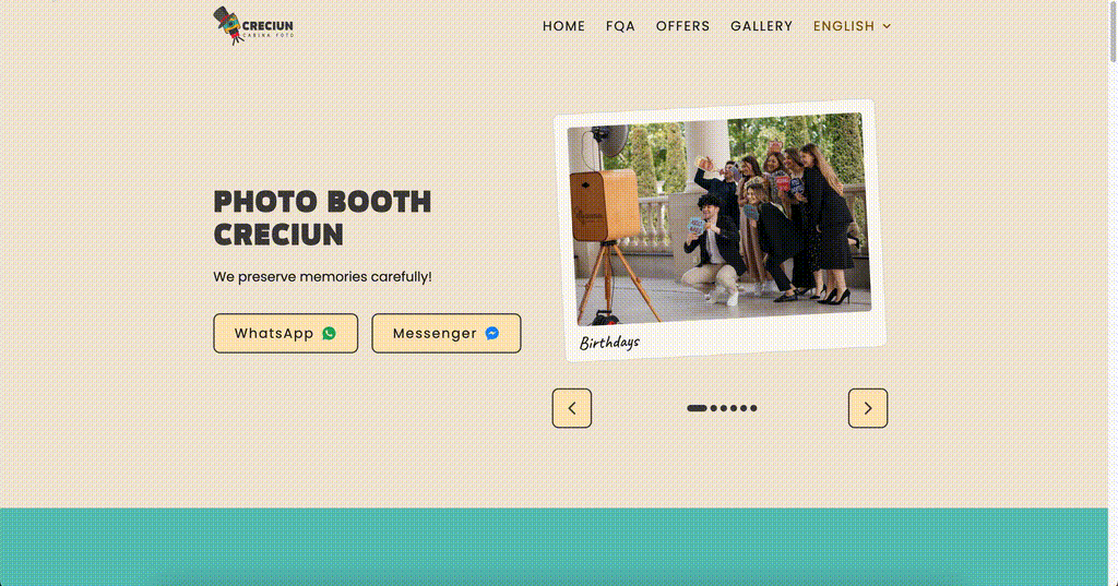
I have added the buttons to WhatsApp and Messenger for direct and comfortable communication.


I have interviewed 10 people, 5 prefer WhatsApp, 4 choose Messenger, and one prefers phone calls as a reservation method.
Also, there is a preference for messaging over calls.
I have described in a simple way how to make a booking.
Optimized navigation
To direct the user to the most important information.
I have removed the Contact page.


I have identified that users are mostly interested in Offers and FQA sections.
Contact forms have low conversion.
Learnings
Some ideas are more efficiently communicated through clear UX writing than through design elements.
In some circumstances, explaining concepts by design is too expensive. In these situations, good writing can be the solution.
Business transparency is the key to the heart of many users.
What’s next?
Refine interactions with further user testing.
Boost social media integration for seamless promotions.
Add motion design to enhance engagement.